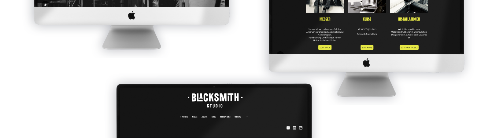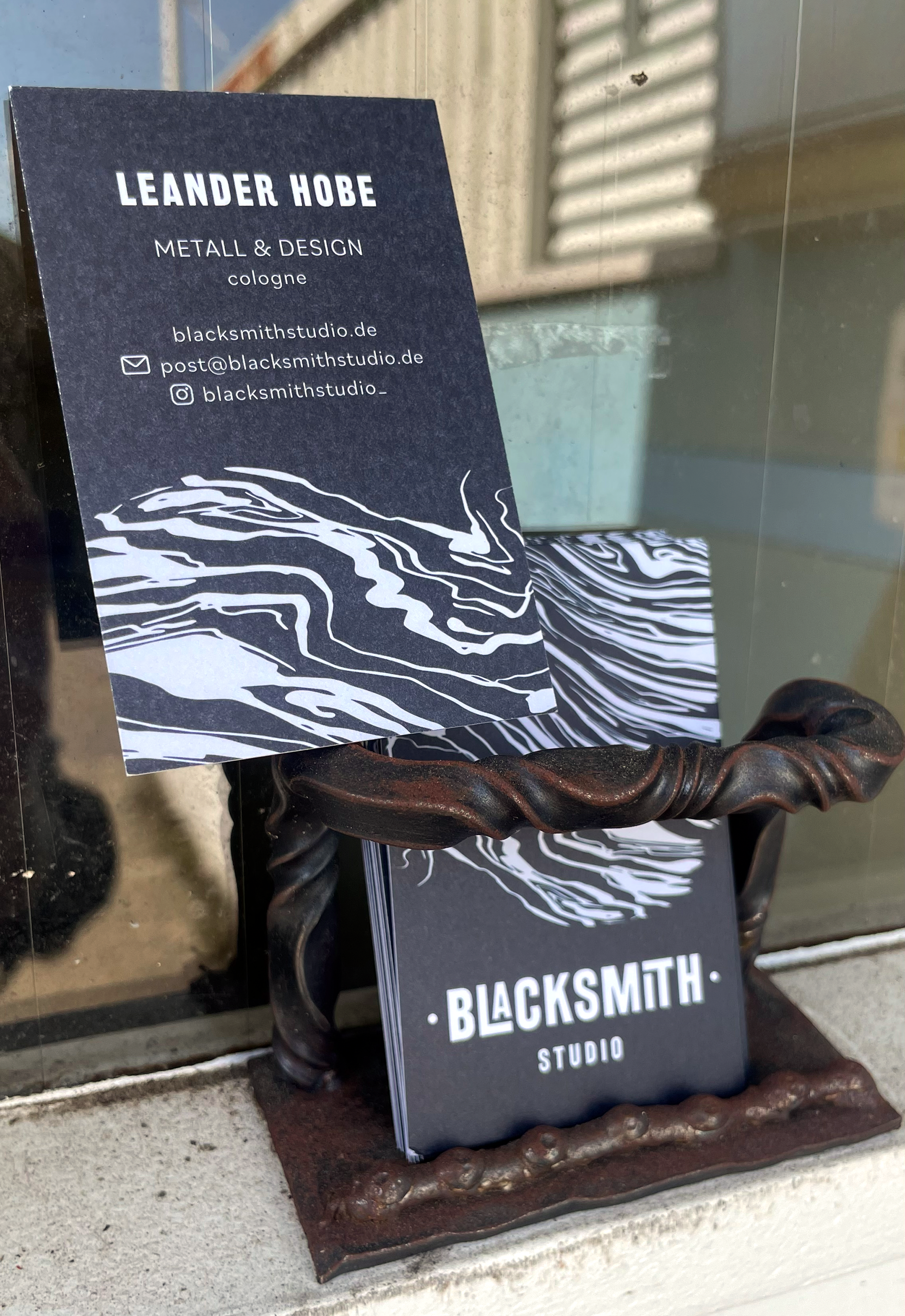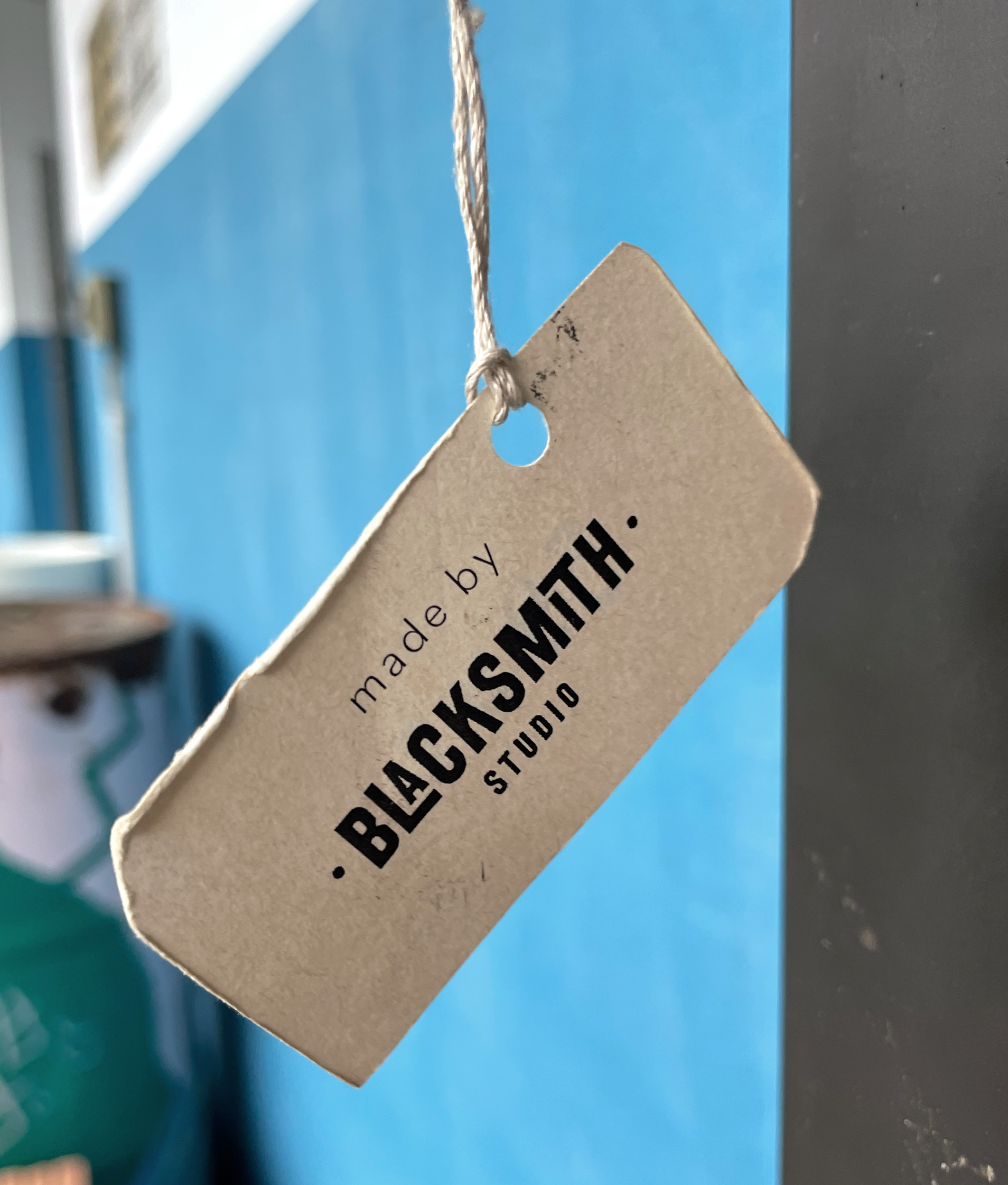
Branding, Business cards, Labels and Website for blacksmith studio, a blacksmith & metal designer.
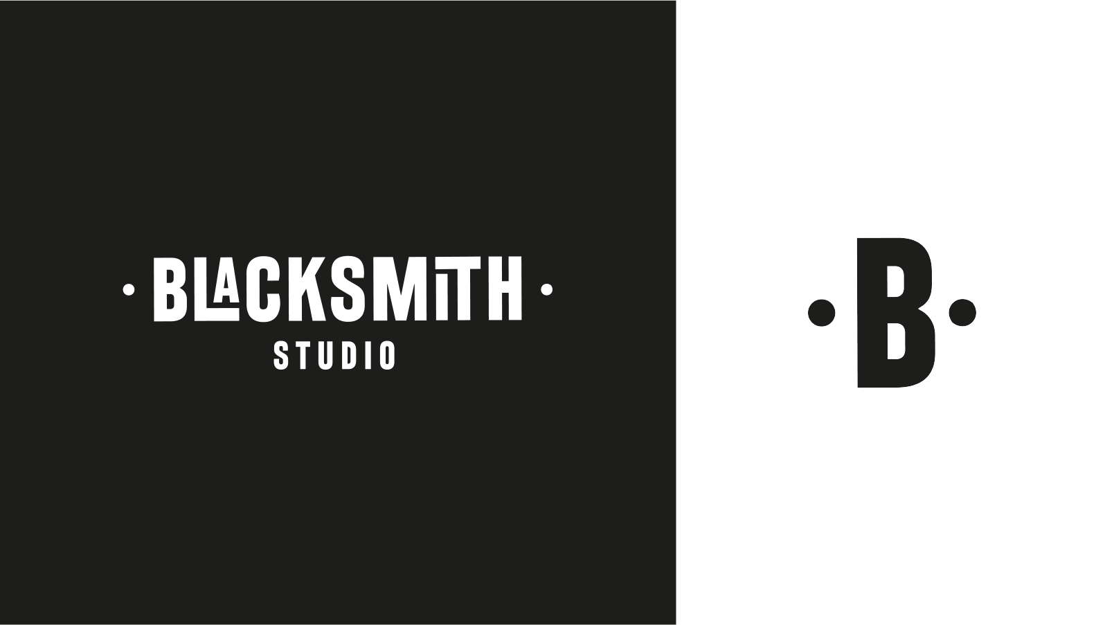
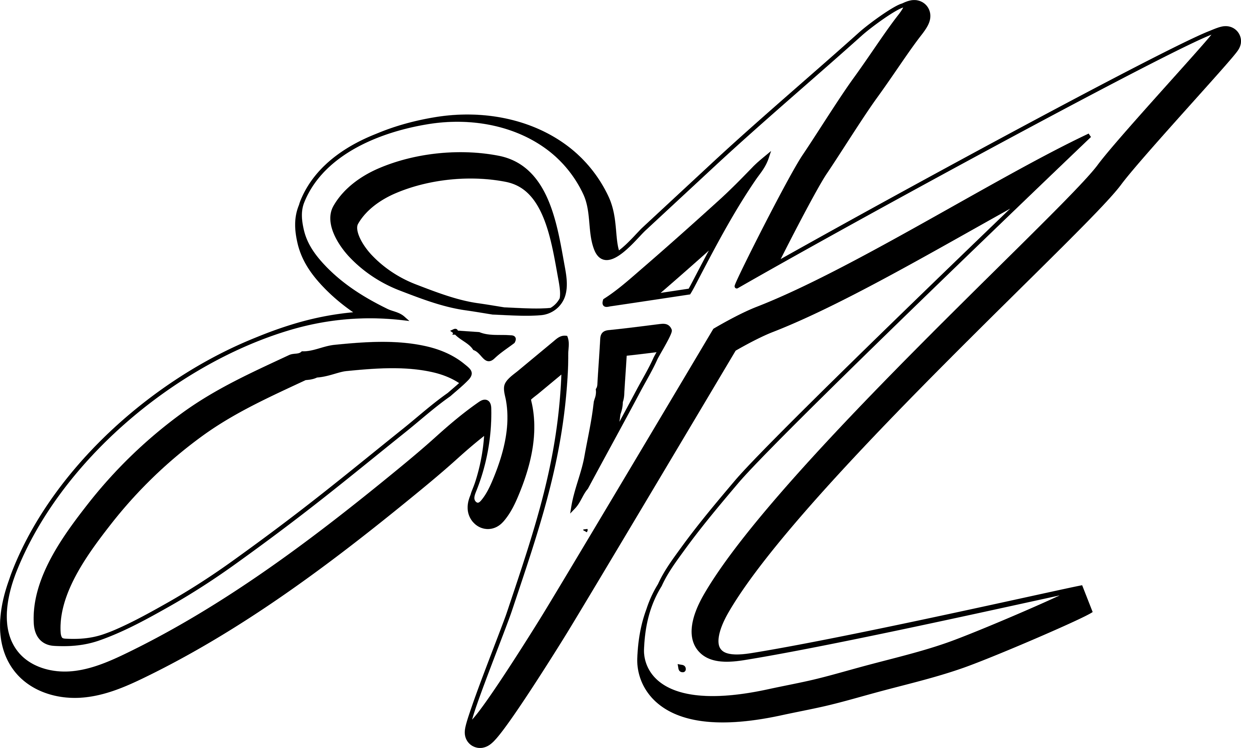
the font of the logo is based on letterpress letters and the whole thing looks like a forged stamp.
The characteristic primary typography was assigned a subordinate one.
The colours black and white underline the power behind the profession itself and form a great contrast with the yellow highlight colour.
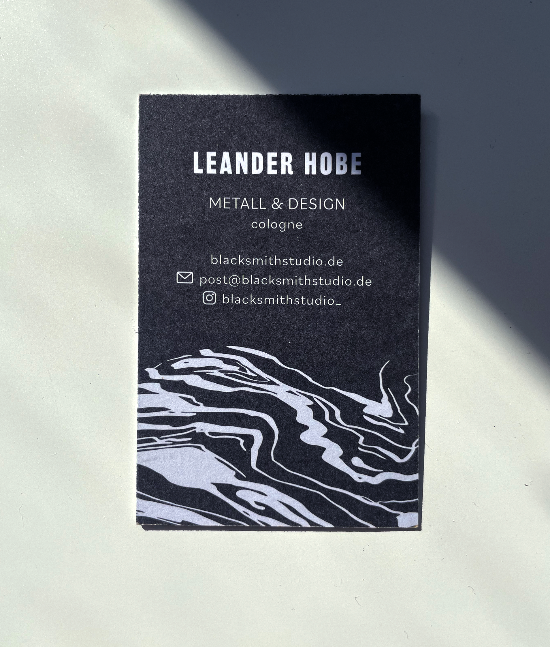
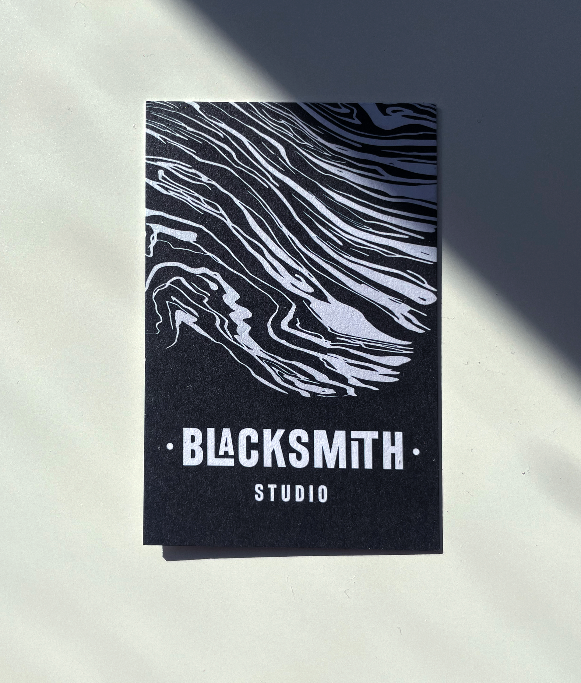
The pattern that is created when knives are forged, known as "damask knives", was taken up in the business cards. In combination with the print on offset paper, this creates a beautiful tactile effect.